We’ve decided to unify the design of your Joomeo environment. As with your space some time ago, we’ve just finished updating some of the pages in your Joomeo account to feature a more modern and efficient design.
These changes will take place gradually over the next few months. The first pages affected will be the ones having to do with your user information, the personalisation of your space and your preferences.
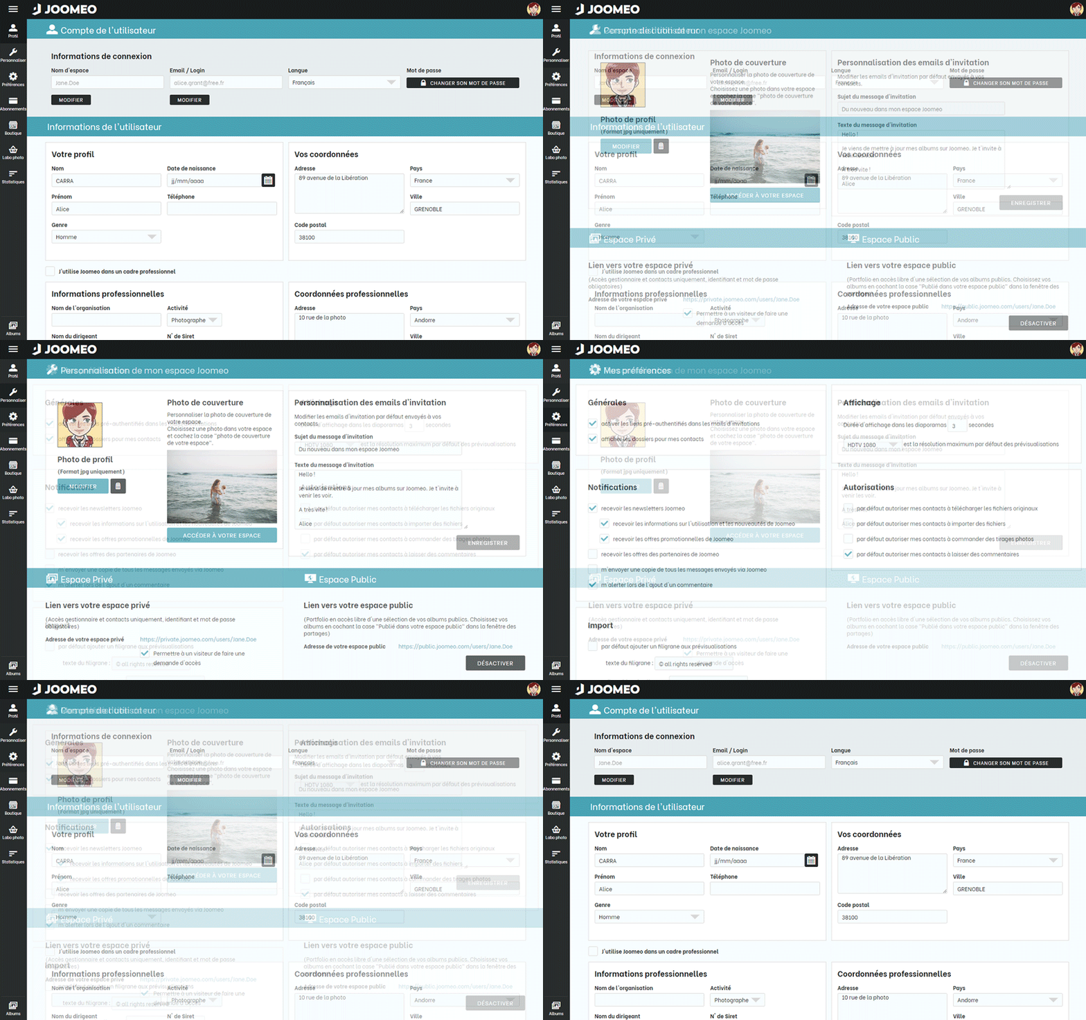


We’re offering you better readability of your information, an improved user experience and a more natural hierarchy with respect to your user information.
A hamburger menu at the top left has also been added. There, you’ll find navigation elements and a certain number of useful statistics regarding your Joomeo space, such as your storage volume, number of files and number of albums, etc.
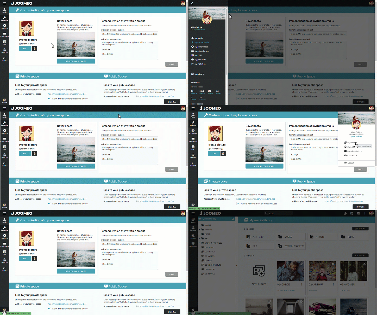


Currently, only certain pages of your account will contain these great improvements. We mentioned which ones at the beginning of the article. Other areas will obviously also be accessible from the navigation bar to the left. They’ll keep their design and will be progressively updated during the next few weeks.


Until then, visit your new Joomeo account and tell us what you think in the comments!




Add comment